How Do I Optimize Images for My Small Business Website?
Resize each image for its real display slot, choose a suitable modern format, serve responsive variants, prioritize the main visual, and verify quality on the live page.
The direct answer
Optimize website images by matching each file to the space where it appears, exporting it in a suitable format, giving the browser responsive size choices, reserving its layout dimensions, and loading it according to its position on the page. The goal is not the smallest possible file. It is the smallest file that still looks right in its real context.
Start with the image customers see first, usually the homepage or service-page hero. Resize it from the original, compare WebP or AVIF with a well-compressed JPEG when appropriate, provide smaller candidates for narrow screens, and do not lazy-load the likely largest above-the-fold image. Then apply the same process to galleries, project photos, team images, article cards, logos, and icons.
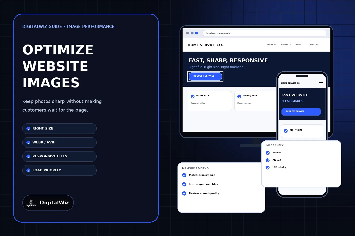
The website and image-delivery panels above are illustrative. They are not a client website, performance report, compression result, traffic result, or ranking claim.
- Keep the original source file outside the public website folder.
- Resize from that original for the image’s actual display slots.
- Choose format and compression by visual content, not by habit.
- Serve responsive candidates instead of one oversized file everywhere.
- Test the rendered page on mobile and desktop before replacing the original.
Begin with the display slot, not the camera file
A phone or camera original may contain far more pixels than a website card, logo strip, or article image can display. Uploading that original and shrinking it with CSS changes how large the image looks, but it does not necessarily stop the browser from downloading the oversized file. Record the rendered width of each important image at common mobile and desktop layouts before choosing export dimensions.
Build a short inventory by template: hero, service card, gallery thumbnail, full gallery view, team portrait, logo, icon, blog card, and social preview. For each slot, note its aspect ratio, maximum rendered width, whether the crop changes on mobile, whether transparency is required, and whether the image appears in the first viewport. A single photo can need several derivatives because a wide hero and a square card are different compositions, not merely different file sizes.
Keep one clean master outside production. Generate web derivatives from that master so later design changes do not depend on repeatedly recompressing an already compressed file. Name derivatives by purpose and size when that helps maintenance, and remove abandoned variants only after confirming that no live page, metadata block, feed, or social preview still references them.
Choose the format by what the image contains
Photographs usually tolerate lossy compression, making WebP, AVIF, or a carefully compressed JPEG practical options. Logos, diagrams, interface graphics, and artwork with sharp edges may need SVG, PNG, or a lossless modern format. Do not convert every asset to one format without looking at the result; gradients, fine text, transparency, and brand colors can expose artifacts that are hard to see in a file-size report.
MDN’s image format guide describes WebP and AVIF as modern raster choices with strong compression, while also explaining their different capabilities and fallback considerations. Use the format your delivery stack and supported browsers handle reliably. A framework or image CDN may negotiate formats automatically, but confirm what the production response actually sends rather than assuming the source extension proves it.
Compare candidate exports at the size customers will see. Inspect rooflines, product edges, faces when legitimately present, small interface text, logos, gradients, shadows, and dark areas. Increase compression only while the result remains acceptable. A slightly larger clean image is better than a small file with ringing, smeared detail, color shifts, or unreadable text baked into the pixels.
- Photos: test WebP or AVIF and retain a compatible fallback when the delivery setup requires one.
- Logos and icons: prefer a clean SVG when the artwork is truly vector.
- Transparency and sharp interface art: compare PNG with lossless WebP or AVIF.
- Social previews: use the platform-ready aspect ratio and inspect the final compressed file.
- Never judge quality from the editor thumbnail alone.
Give the browser responsive choices
A responsive layout should not force a narrow phone to download the same image candidate intended for a large desktop display. HTML srcset and sizes let the browser choose among width-specific files based on the image’s intended layout size and the device display. The web.dev responsive images guide shows how width descriptors and the sizes attribute work together.
The sizes value must describe the actual layout. If an image occupies the full viewport on a phone, half the page on a tablet, and a fixed content column on desktop, state those conditions accurately. An incorrect default can make the browser select a larger candidate than the design needs. Recheck the rule when a redesign changes columns, card widths, breakpoints, or maximum page width.
Use the picture element when the crop or composition must change, not merely when the file gets smaller. A wide desktop banner can become illegible if it is squeezed into a tall mobile slot. An intentional mobile crop should keep the subject, product, or focal point visible instead of letting an automatic center crop cut off the useful part.
Treat the first important image differently
Lazy loading is useful for images well below the first viewport because it delays work the visitor may never need. It is a poor default for the main image that is already visible when the page opens. The browser-level lazy-loading guidance on web.dev recommends loading in-viewport images normally and using lazy loading for offscreen images.
Identify the likely main visual on each important template. Make it discoverable in the initial page markup, avoid hiding it behind unnecessary scripts, and use the framework’s supported priority mechanism when appropriate. Do not mark every image high priority; competing priorities weaken the signal and can crowd out styles, fonts, and other resources needed to render the first screen.
Then lazy-load gallery images, related-post thumbnails, and other visuals that begin below the fold. Test real navigation and scrolling rather than trusting the attribute alone. An image that technically loads but appears late, flashes into place, or never loads inside a carousel still creates a poor customer experience.
Reserve space before the image arrives
Set intrinsic width and height values, or otherwise provide a stable aspect ratio, so the browser can reserve the correct space before the file finishes loading. This reduces page movement that can cause a customer to lose their reading position or tap the wrong control. Keep responsive CSS such as max-width and automatic height so the image can scale without distortion.
The declared dimensions should match the source aspect ratio. Do not force a landscape image into a square box by changing only its HTML dimensions. Use an intentional crop and an object-fit rule when the design calls for a fixed frame, then inspect the focal point at each breakpoint. The same check applies to content-management systems that generate thumbnails automatically.
Watch fixed headers, overlays, sliders, and expanding captions around the image. Image optimization does not help if the layout still shifts because another component changes height after load. Diagnose the rendered page as a complete system instead of treating the image encoder as the only performance control.
Keep image meaning and discovery intact
Compression should not erase accessibility or context. Give meaningful images concise alternative text that communicates their purpose on that page, and use empty alt text for images that are purely decorative. The DigitalWiz guide to writing alt text for business website images covers that decision in detail.
Use stable, descriptive filenames when practical, keep important images near relevant visible copy, and preserve useful captions. Google’s image SEO guidance recommends descriptive filenames and alt text in context, while warning against keyword stuffing. A filename is a light clue, not a substitute for a useful page or an accurate text alternative.
When replacing a live file, verify every surface that may use it: the page image, card thumbnail, Open Graph and Twitter metadata, structured data, feed, and cached transformation URL. A sharp hero beside an outdated social preview means the replacement is only partly complete.
Verify the production page, not only the export folder
Test the custom production domain on a narrow phone viewport and a desktop viewport. Confirm that each image returns successfully with the expected content type, the browser selects a sensible candidate, the main visual is not lazy-loaded, below-fold images load when approached, dimensions reserve space, alternative text is correct, and no crop hides important content.
Use browser network tools to compare transferred bytes and selected image candidates before and after the change. Use a performance tool to identify the actual largest visible element, but pair the report with visual inspection. A lower byte count is not a win if the customer sees blur, broken transparency, missing imagery, or a delayed hero.
Change a small representative set first. Once the hero, one card, one gallery image, and one logo or graphic pass visual and technical checks, apply the proven export rules to the matching asset class. Keep a rollback copy and avoid changing filenames or URLs unnecessarily when stable references and caches already exist.
- Image URL returns 200 with the expected MIME type.
- Mobile and desktop receive sensible candidates and crops.
- The main image appears promptly and below-fold images defer correctly.
- No visible blur, halos, color shifts, clipping, or layout movement.
- Hero, cards, metadata, schema, feeds, and social previews agree.
Use a repeatable image workflow
For every new image, keep the original, define the intended slots, create aspect-aware crops, export suitable formats and widths, add dimensions and alternative text, set loading priority, and inspect the final page. Record the rule in the website’s publishing process so the next upload does not return to camera originals and one-size-fits-all files.
Begin with the five images most visible to customers: the homepage hero, the main image on the highest-value service page, the first project or gallery image, the primary logo, and the default social preview. If you need the image pipeline reviewed alongside page speed, responsive design, and lead paths, explore DigitalWiz Website Development or contact DigitalWiz for a practical plan.